Straight or Curly Quotation Marks Matter
- Karina Zelaya

- Feb 28
- 3 min read

Straight vs. curly quotation marks. Something small that actually makes a big difference.
For the sake of clarity, I will be speaking about this from the perspective of the CMOS. I live and train in the US, and the CMOS is our most common style guide for publishing, so that’s what I am most familiar with.
So, let’s back up a little bit. For those of you who don’t know what I mean by “straight vs. curly,” I mean the shape of the quotation mark. Basically, it’s a floating, normal or inverted, comma.
Straight "
Curly (also called smart) “
Isn’t It As Simple As Changing The Font?
Your next question might be, “Isn’t it as simple as changing the font?” And to that, I’ll say, “I wish.”
Most, if not all, fonts have the ability to output either straight or curly marks. Most platforms will render them straight, but thankfully, the more common processors have a setting you can switch on to auto-change all quotation marks to “smart.” So . . . do that.
In One-Drive, you’ll find it here: [Review > Editor > Autocorrect Options]
Why Does This Matter?
Depending on the style guide you are using, it will tell you to use one or the other across the board. CMOS, for example, has a non-negotiable rule to use curly quotes. Double or single, they all need to be curly.
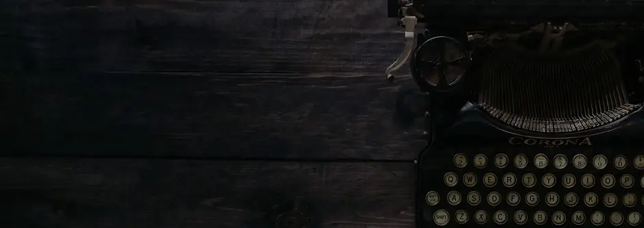
Historically, curly quotes were the standard until typewriters. Typewriters were designed to print straight quotes because of space limitations of the mechanical letters.
A single straight quotation mark could be used for an opening quote, a closing quote, and an apostrophe.
A double straight quotation mark could be used for an opening quote and a closing quote.
Meaning, they could use the added keyboard space for more letters. Sooo the creator of the typewriter solved one problem while creating confusion for the rest of time.
Today, we don’t generally have these issues. Some of our keyboards have two number pads, for goodness’ sake. The straight marks no longer serve a purpose outside of aesthetics.
All that being said, why does it matter? It matters because it’s a publishing standard, and when one person doesn’t use it, it becomes distracting.
The Power of Recognition
The reason we have style guides in general is to create an organized and leisurely environment for the reader.
For example, history books use Chicago citations. They use footnotes to organize all their references so you can continue to read a complete thought without being stopped by an in-text citation. Can you imagine if your history books used MLA? It would be impossible to read a single page without stressing yourself out.
So, think about this: If you picked up a history book and wanted to know where they got some information, where would you automatically look without even thinking about it? Probably at the bottom of the page. You have been seasoned to find what you are looking for since you were a child. The distraction of having to search is taken away because you know where the answer is.
The same concept applies to other works, including creative writing. When you read a book, you expect italicized words to be said with emphasis. Or the . . . to indicate someone’s words drifting off. If this suddenly changed, the book would be really hard to read.
Therefore, we have style guides. And yes, I know a simple quotation mark shape seems small, but why risk taking your reader out of the story over something as simple as a quotation mark?
Apostrophe’s too?
Yep-aroonie. Single and double opening quotation marks, single and double closing quotation marks, and apostrophes should all be curly.
Oh, and be careful if you try to find/replace. A lot of times, Word can’t tell the difference between opening and closing, so you might end up with a bunch of opening marks where closing should be, and vice versa.
TLDR
Curly is in. Straight is out. Blame Christopher Latham Sholes.


Comments